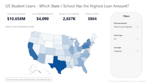
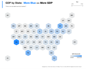
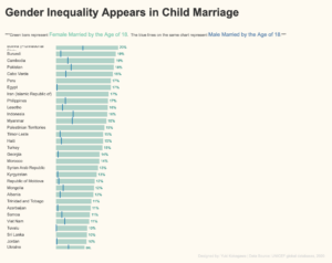
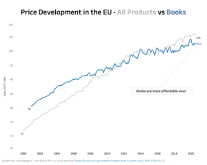
Which State / School Has the Highest Amount of Student Loans?
MoM 2021 Week24 – Power BI
Hexagon Tile Map in Tableau
MoM 2020 Week40 - Tableau
Gender Inequality in Child Marriage
MoM 2020 Week39 - Tableau
Books Are More Affordable Than Other Products in the EU
MoM 2020 Week38 - Tableau
Multiple Lines to Show Difference
MoM 2020 Week37 - Tableau
Digital Companies in Scotland
MoM 2020 Week33 - Tableau
Sort Dimensions in a Single Click in Tableau
WoW 2020 Week1 - Tableau
Amazon is Investing in the Future…
MoM 2020 Week25 – Tableau A simple line chart showing a distinct pattern of Amazon’s revenues over time. Their profit started to increase around 2016! Interactive visualization
Greenhouse Gas Emission Across Supply Chain
MoM 2020 Week16 – Tableau Beef has the worst gas emissions across supply chain! I’ve heard that eating plant based foods is the best thing humans can do to reduce gas emissions, but this data confirms that information. This is why we need to look at data to see what is actually happening! We also...
Messi vs Ronald – Which Player is Better?
MoM 2020 Week15 – Tableau Messi and Ronald, they are both great soccer players, but which one is actually better? The answer to that questions is shown in this visualization. Tableau allows us to show each data point as a circle so that we can compare them side by side. I don’t recall the name...
Women Spent More Hours on Unpaid Work
MoM 2020 Week14 – Tableau I chose a simple bar chart to show difference in the unpaid hours of work spent between women and men. Women spend more than twice the amount of time on unpaid work than men, which is surprising! I initially thought that men would work longer, but this data / analysis...
Most Popular Pizza Topping in UK
MoM 2020 Week13 – Tableau This is my first time learning about and creating a lollipop chart. It give a bar chart a little more clarity in your message, depending on how you use it. I love how the color is used sparingly, but effectively, distinguishing between women and men. Gray color plays a vital...
How Many Courses are Taught at Berkeley?
MoM 2020 Week12 – Tableau I didn’t know if you have multiple line charts then you call them as small multiples… There is an option you can toggle in Power BI, but in Tableau, you just create each line chart separately and put them all together in one dashboard. As you can see in this...
Are Money and Happiness Correlated?
MoM 2020 Week11 – Tableau There is a clear trend telling us that the more money you have, the happier you may be. I created a bubble chart where the color of each value is dynamically set based on life satisfaction as well as GDP per capita. This was a little challenging but once you...
What Animal Could You Beat in a Fight?
MoM 2021 Week20 - Power BI
Bar Chart with Simple Use of Color
MoM 2020 Week10 – Tableau It’s very interesting that the analysis tells you that if women don’t have education then violence against them are not likely to be justified (certain countries, see the data viz below). Data Source | Interactive visualization
Tableau Dashboard – Superstore
A tableau dashboard showing an overview of the profitability at Superstore (sample dataset). Only 2 colors are used, blue and orange. As you can see, orange represents negative values, whereas blue color shows the positive values. Conditional color is implemented in tooltip texts as well. You can see and understand the trends in just a...
Sankey Chart in Tableau
MoM 2020 Week8 – Tableau I created a Sankey Chart for the first time! I didn’t even know such data visualization chart existed. But here it goes, I tried creating something completely new! It was fun and a struggle in getting a sankey chart to life. The article explains how to go about creating a...
Comparison in a Bar Chart
MoM 2020 Week3 – Tableau This one looks like what a data viz newbie created, but I still like the use of color, which is simple and clear to its purpose. It looks like both children and adults take too much calories from free sugars… Data Source | Interactive visualization
Area Chart Showing Percentage Life at War
MoM 2020 Week6- Tableau My first time that I added a caption in a data viz. A caption makes it easy to tell the audience a specific message or analysis. Looking back, think this is where I kinda started understanding how Tableau works. Putting a year slicer will allow users to quickly see the data...
Which Country is the Richest?
MoM 2020 Week7 – Tableau I created more of a dashboard than a visualization for MoM2020 Week7. I always emphasize the part or data that should get the attention the most by making it colored or bigger in size. I follow the practice of the lesser number of colors you use, the cleaner the visualizations...
Majority Support Black James Bond
MoM 2020 Week4 – Tableau This time, I was to create a visualization to show how people were supportive of black James Bond. I remember struggling creating this particular visual where a label in the middle and bars on both sides. Data Source | Interactive data visualization
Harmful Pesticides in USA Agriculture
MoM 2020 Week2 – Tableau The data visualization I created for Makeover Monday 2020 Week2. It shows the use of harmful pesticides in US agriculture. I can literally see how I wasn’t used to using Tableau at the time I created this… But looking at my recent projects and comparing this visualization, I can see...
What’s the America’s Most Popular Sport?
MoM 2020 Week1 – Tableau This is a visualization I created on a dataset of the sports popularity in the US. I think this is the very first tableau visualization I’ve created! Here is the link to the data source. Link to the interactive visualization