Menu
Stuff by Yuki
  • Home
  • Python
  • Power BI
  • Tableau
  • Community
    • Makeover Monday
    • Workout Wednesday
  • About
  • Contact
Stuff by Yuki

Sankey Chart in Tableau

Posted on May 18, 2021

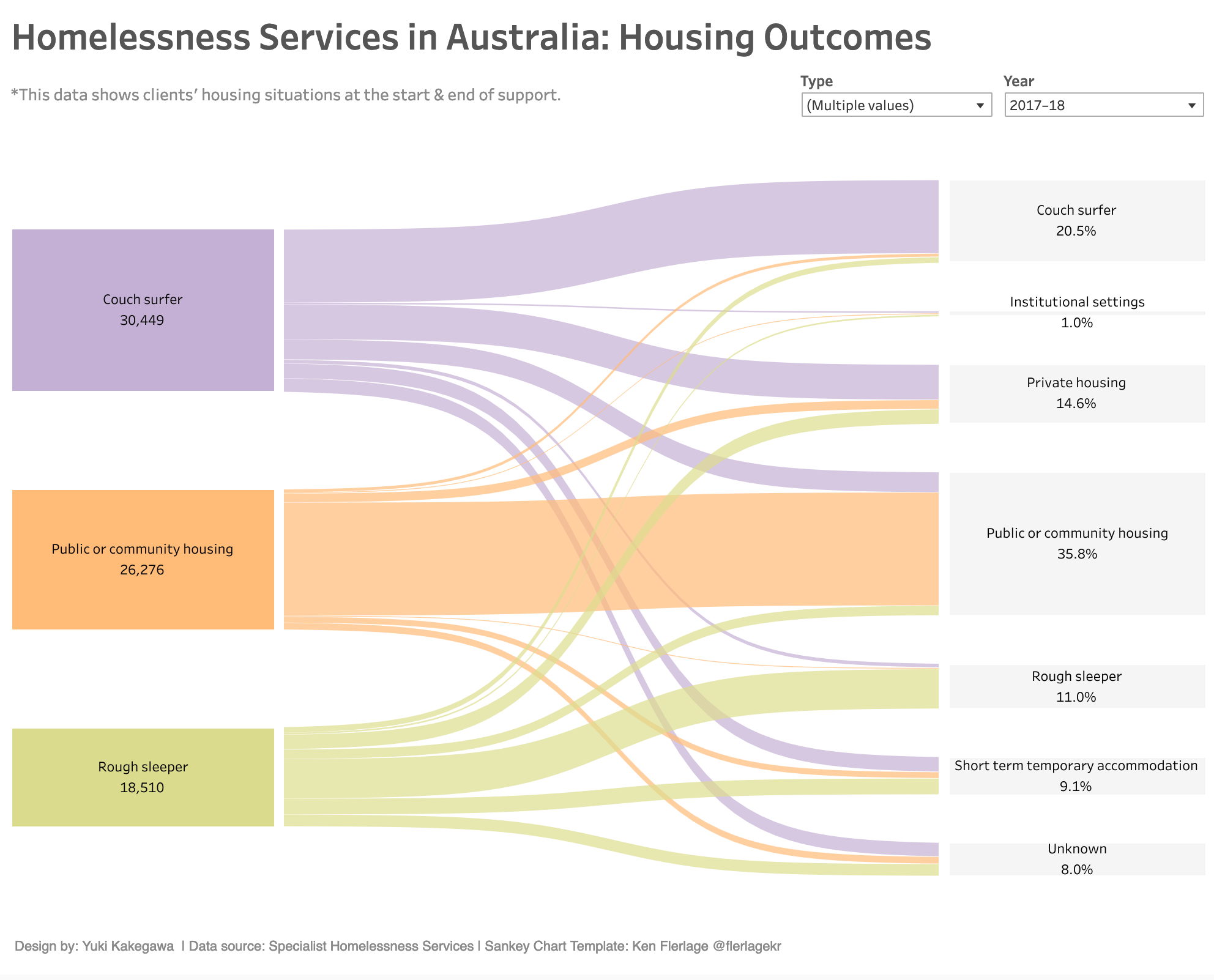
MoM 2020 Week8 – Tableau

I created a Sankey Chart for the first time! I didn’t even know such data visualization chart existed. But here it goes, I tried creating something completely new! It was fun and a struggle in getting a sankey chart to life.

The article explains how to go about creating a sankey chart in tableau. Link

Data Source | Interactive visualization

Leave a Reply Cancel reply

Your email address will not be published. Required fields are marked *

Recent Posts

  • What are Power BI Dataflows?
  • Calculate the Max Sales Amount for Product
  • Convert DataFrame to Series in Polars
  • Pandas vs Polars – Speed Comparison
  • Polars with DuckDB – Using SQL in Polars

Popular Posts

  • A Running Total Calculation with Quick Measure in Power BI
  • How To Copy And Paste Report Page in Power BI
  • Year-Over-Year Calculation: Time Intelligence in Power BI
  • How to Fill Dates Between Start Date and End Date in Power BI (Power Query)
  • Network Visualizations in Python

connect with me

  • LinkedIn
  • Twitter
  • Github
©2023 Stuff by Yuki | Powered by SuperbThemes & WordPress