Menu
Stuff by Yuki
  • Home
  • Python
  • Power BI
  • Tableau
  • Community
    • Makeover Monday
    • Workout Wednesday
  • About
Stuff by Yuki

Most Popular Pizza Topping in UK

Posted on May 22, 2021

MoM 2020 Week13 – Tableau

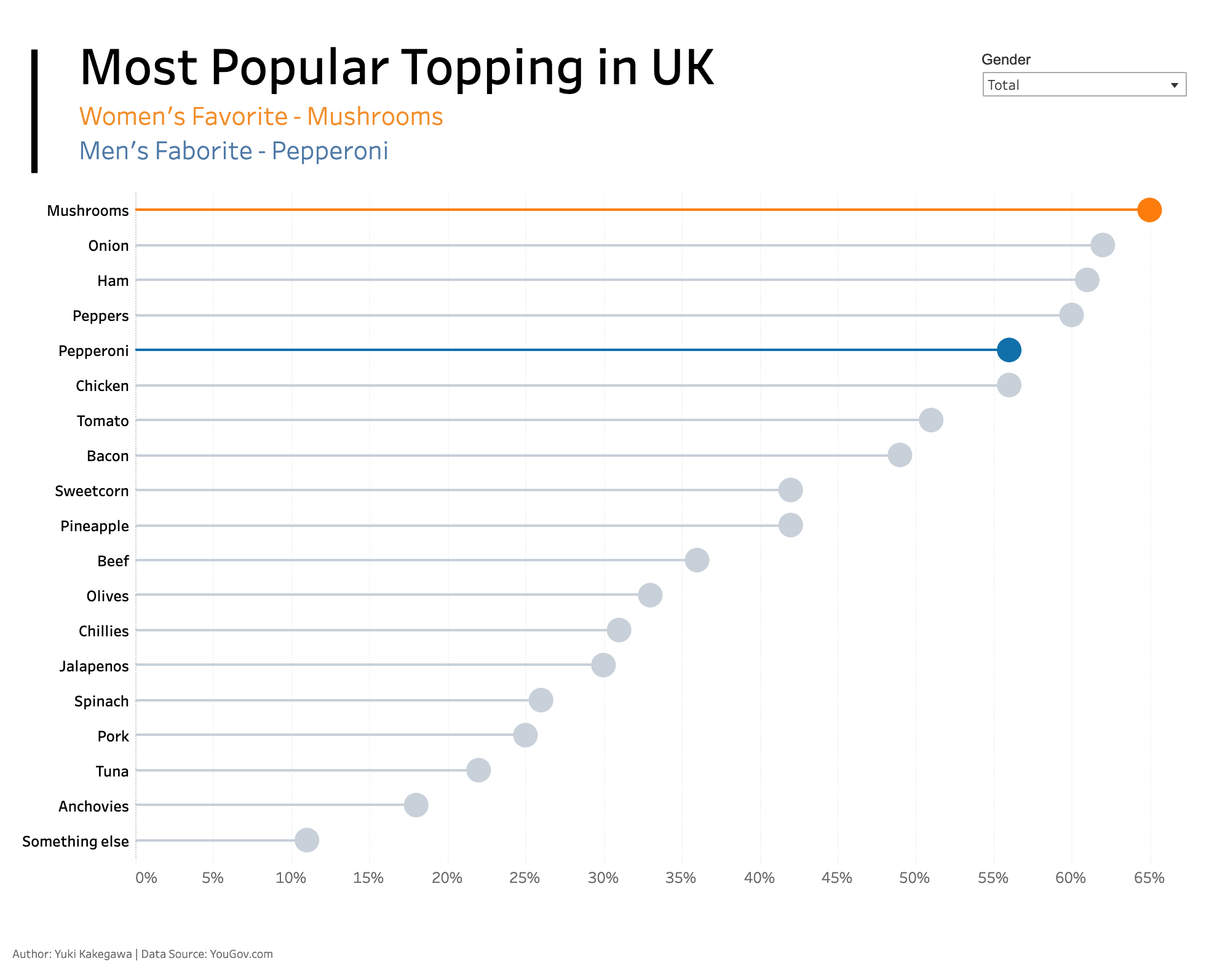
This is my first time learning about and creating a lollipop chart. It give a bar chart a little more clarity in your message, depending on how you use it. I love how the color is used sparingly, but effectively, distinguishing between women and men. Gray color plays a vital role if you think about how to make other colors stand out in your visualization.

Interactive visualization

Post Views: 11

Leave a Reply Cancel reply

Your email address will not be published. Required fields are marked *

Popular Posts

  • A Running Total Calculation with Quick Measure in Power BI
  • How To Copy And Paste Report Page in Power BI
  • How to Fill Dates Between Start Date and End Date in Power BI (Power Query)
  • How to Create an Information Panel in Power BI
  • My Experience Passing DA-100 Exam – Microsoft Certified: Data Analyst Associate

Recent Posts

  • How I Passed AWS Certified Developer Exam (DVA-C01)
  • Network Visualizations in Python – Introduction to NetworkX and Pyvis
  • DAX.do is a sandbox for DAX
  • Python Pandas .apply() function – how does it differ from .applymap() and .map()?
  • How To Copy And Paste Report Page in Power BI

connect with me

  • LinkedIn
  • Twitter
  • Github
©2022 Stuff by Yuki | Powered by SuperbThemes & WordPress