Menu
Stuff by Yuki
  • Home
  • Python
  • Power BI
  • Tableau
  • Community
    • Makeover Monday
    • Workout Wednesday
  • About
  • Contact
Stuff by Yuki

Multiple Lines to Show Difference

Posted on May 31, 2021June 15, 2021

MoM 2020 Week37 – Tableau

One of the ways to get some creativity in your visualization is to use graphics. This time, I used a photo of a black board along with a line chart.

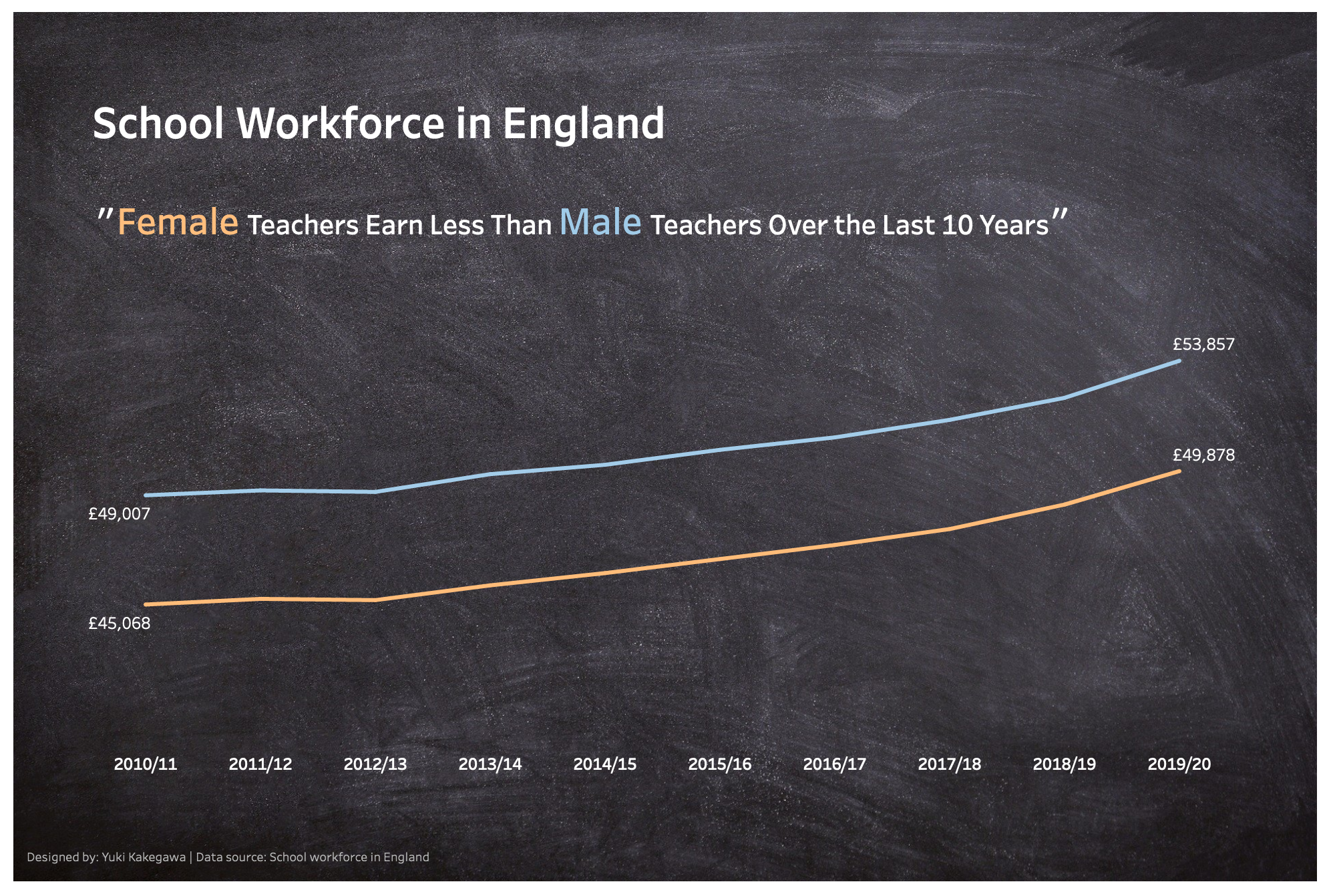
Looking at this visualization, I realize that I probably could use another chart showing the actual difference or % difference between male and female teachers.

Interactive visualization

Leave a Reply Cancel reply

Your email address will not be published. Required fields are marked *

Recent Posts

  • How to Convert String to Date or Datetime in Polars
  • Aggregations Over Multiple Columns in Polars
  • DuckDB with Polars, Pandas, and Arrow
  • Read from and Write to Amazon S3 in Polars
  • Handling Missing Values in Polars

Popular Posts

  • A Running Total Calculation with Quick Measure in Power BI
  • How To Copy And Paste Report Page in Power BI
  • How to Fill Dates Between Start Date and End Date in Power BI (Power Query)
  • Year-Over-Year Calculation: Time Intelligence in Power BI
  • Network Visualizations in Python

connect with me

  • LinkedIn
  • Twitter
  • Github
©2023 Stuff by Yuki | Powered by SuperbThemes & WordPress