Menu
Stuff by Yuki
  • Home
  • Python
  • Power BI
  • Tableau
  • Community
    • Makeover Monday
    • Workout Wednesday
  • About
Stuff by Yuki

Harmful Pesticides in USA Agriculture

Posted on May 12, 2021

MoM 2020 Week2 – Tableau

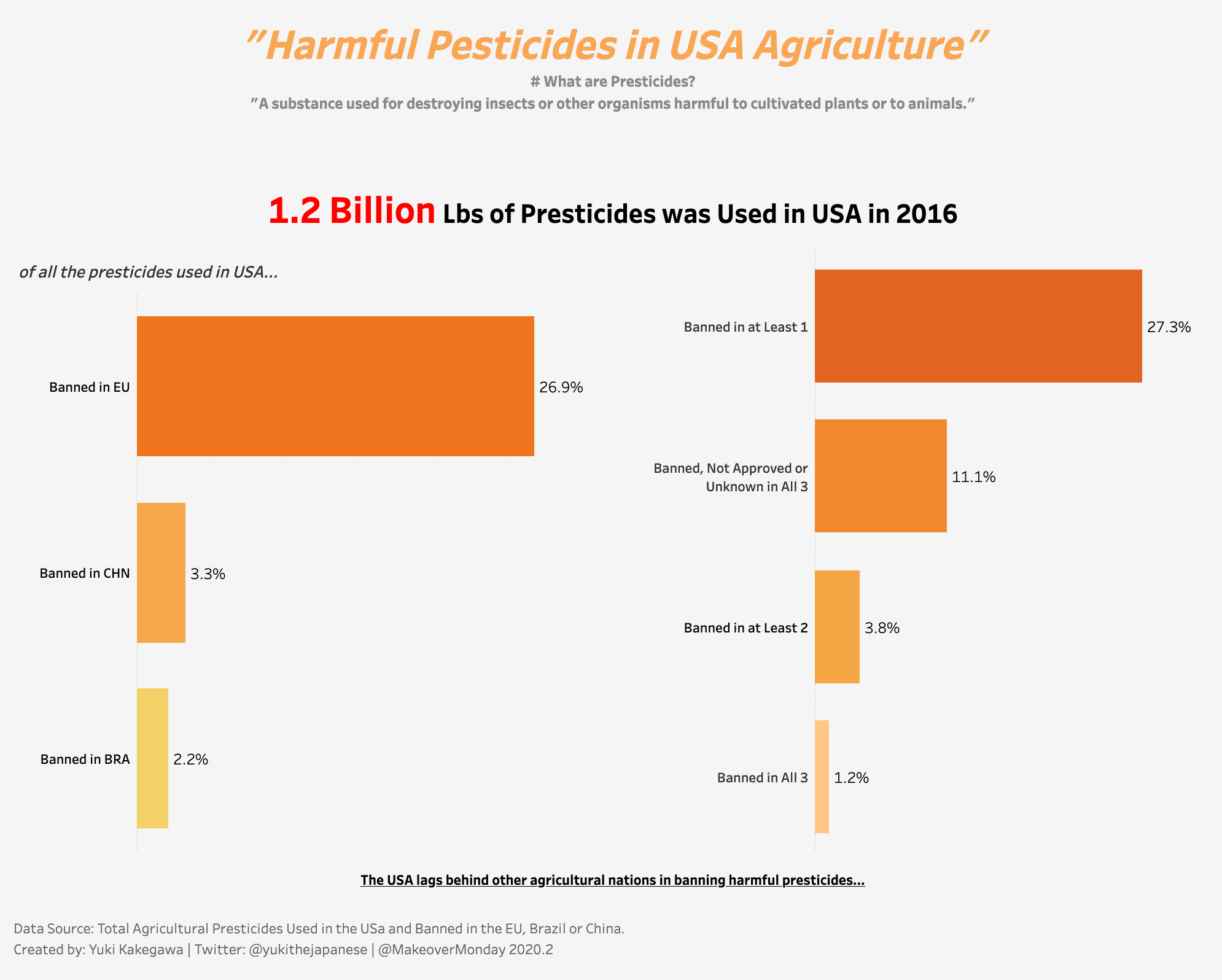
The data visualization I created for Makeover Monday 2020 Week2. It shows the use of harmful pesticides in US agriculture.

I can literally see how I wasn’t used to using Tableau at the time I created this… But looking at my recent projects and comparing this visualization, I can see my progress!

Link to the interactive visualization

Post Views: 30

Leave a Reply Cancel reply

Your email address will not be published. Required fields are marked *

Popular Posts

  • A Running Total Calculation with Quick Measure in Power BI
  • How To Copy And Paste Report Page in Power BI
  • How to Fill Dates Between Start Date and End Date in Power BI (Power Query)
  • How to Create an Information Panel in Power BI
  • My Experience Passing DA-100 Exam – Microsoft Certified: Data Analyst Associate

Recent Posts

  • How I Passed AWS Certified Developer Exam (DVA-C01)
  • Network Visualizations in Python – Introduction to NetworkX and Pyvis
  • DAX.do is a sandbox for DAX
  • Python Pandas .apply() function – how does it differ from .applymap() and .map()?
  • How To Copy And Paste Report Page in Power BI

connect with me

  • LinkedIn
  • Twitter
  • Github
©2022 Stuff by Yuki | Powered by SuperbThemes & WordPress