Menu
Stuff by Yuki
  • Home
  • Python
  • Power BI
  • Tableau
  • Community
    • Makeover Monday
    • Workout Wednesday
  • About
Stuff by Yuki

Bar Chart with Simple Use of Color

Posted on May 19, 2021

MoM 2020 Week10 – Tableau

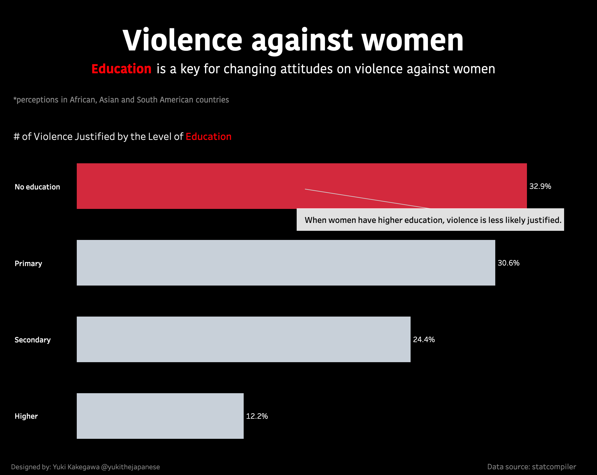
It’s very interesting that the analysis tells you that if women don’t have education then violence against them are not likely to be justified (certain countries, see the data viz below).

Data Source | Interactive visualization

Post Views: 42

Leave a Reply Cancel reply

Your email address will not be published. Required fields are marked *

Popular Posts

  • A Running Total Calculation with Quick Measure in Power BI
  • How To Copy And Paste Report Page in Power BI
  • How to Fill Dates Between Start Date and End Date in Power BI (Power Query)
  • How to Create an Information Panel in Power BI
  • Hierarchical Sorting in Power BI

Recent Posts

  • How I Passed AWS Certified Developer Exam (DVA-C01)
  • Network Visualizations in Python – Introduction to NetworkX and Pyvis
  • DAX.do is a sandbox for DAX
  • Python Pandas .apply() function – how does it differ from .applymap() and .map()?
  • How To Copy And Paste Report Page in Power BI

connect with me

  • LinkedIn
  • Twitter
  • Github
©2022 Stuff by Yuki | Powered by SuperbThemes & WordPress