Menu
Stuff by Yuki
  • Home
  • Python
  • Power BI
  • Tableau
  • Community
    • Makeover Monday
    • Workout Wednesday
  • About
  • Contact
Stuff by Yuki

Area Chart Showing Percentage Life at War

Posted on May 17, 2021

MoM 2020 Week6- Tableau

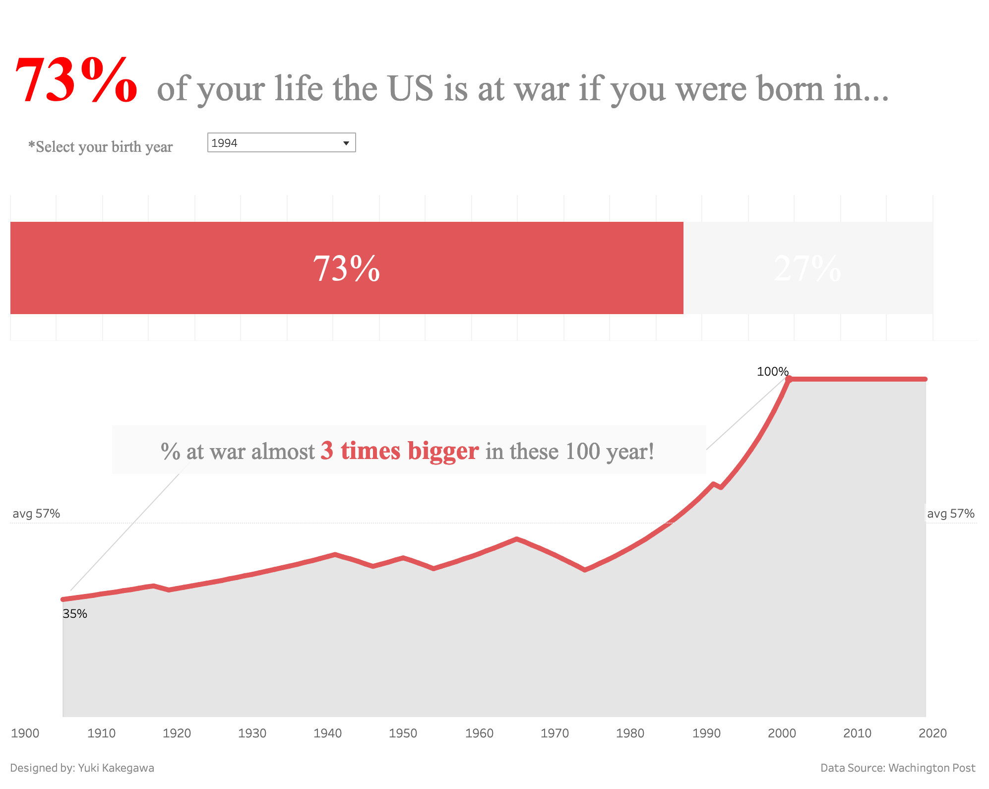
My first time that I added a caption in a data viz. A caption makes it easy to tell the audience a specific message or analysis. Looking back, think this is where I kinda started understanding how Tableau works.

Putting a year slicer will allow users to quickly see the data that’s relevant to them.

Data Source | Interactive visualization

Leave a Reply Cancel reply

Your email address will not be published. Required fields are marked *

Recent Posts

  • What are Power BI Dataflows?
  • Calculate the Max Sales Amount for Product
  • Convert DataFrame to Series in Polars
  • Pandas vs Polars – Speed Comparison
  • Polars with DuckDB – Using SQL in Polars

Popular Posts

  • A Running Total Calculation with Quick Measure in Power BI
  • How To Copy And Paste Report Page in Power BI
  • Year-Over-Year Calculation: Time Intelligence in Power BI
  • How to Fill Dates Between Start Date and End Date in Power BI (Power Query)
  • Network Visualizations in Python

connect with me

  • LinkedIn
  • Twitter
  • Github
©2023 Stuff by Yuki | Powered by SuperbThemes & WordPress