Menu
Stuff by Yuki
  • Home
  • Python
  • Power BI
  • Tableau
  • Community
    • Makeover Monday
    • Workout Wednesday
  • About
  • Contact
Stuff by Yuki

How Many Courses are Taught at Berkeley?

Posted on May 22, 2021

MoM 2020 Week12 – Tableau

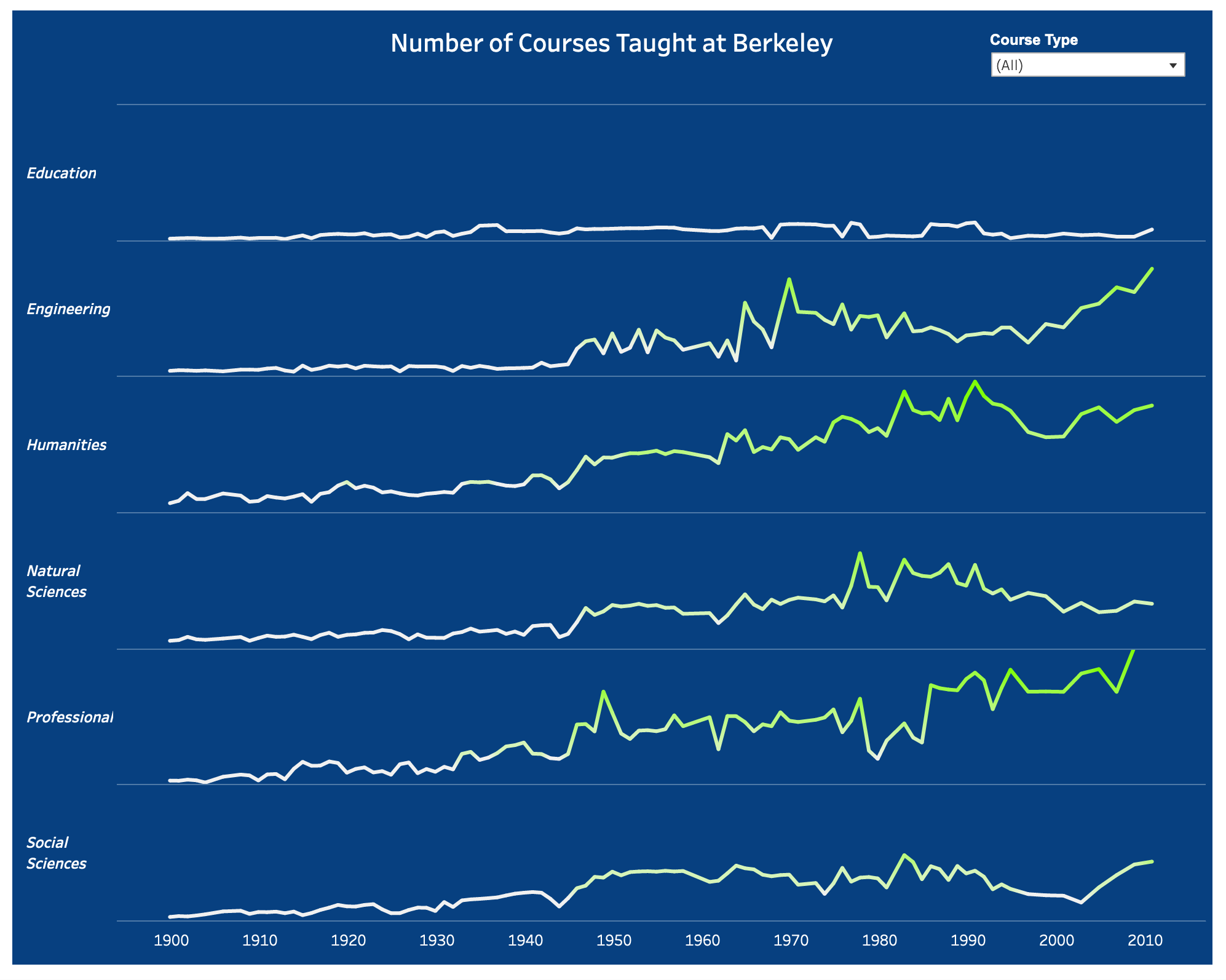
I didn’t know if you have multiple line charts then you call them as small multiples… There is an option you can toggle in Power BI, but in Tableau, you just create each line chart separately and put them all together in one dashboard.

As you can see in this visual, education course may be the only course that didn’t go up in number for whatever reason behind it.

Interactive visualization

Leave a Reply Cancel reply

Your email address will not be published. Required fields are marked *

Recent Posts

  • What are Power BI Dataflows?
  • Calculate the Max Sales Amount for Product
  • Convert DataFrame to Series in Polars
  • Pandas vs Polars – Speed Comparison
  • Polars with DuckDB – Using SQL in Polars

Popular Posts

  • A Running Total Calculation with Quick Measure in Power BI
  • How To Copy And Paste Report Page in Power BI
  • Year-Over-Year Calculation: Time Intelligence in Power BI
  • How to Fill Dates Between Start Date and End Date in Power BI (Power Query)
  • Network Visualizations in Python

connect with me

  • LinkedIn
  • Twitter
  • Github
©2023 Stuff by Yuki | Powered by SuperbThemes & WordPress