MoM 2020 Week3 – Tableau
This one looks like what a data viz newbie created, but I still like the use of color, which is simple and clear to its purpose.
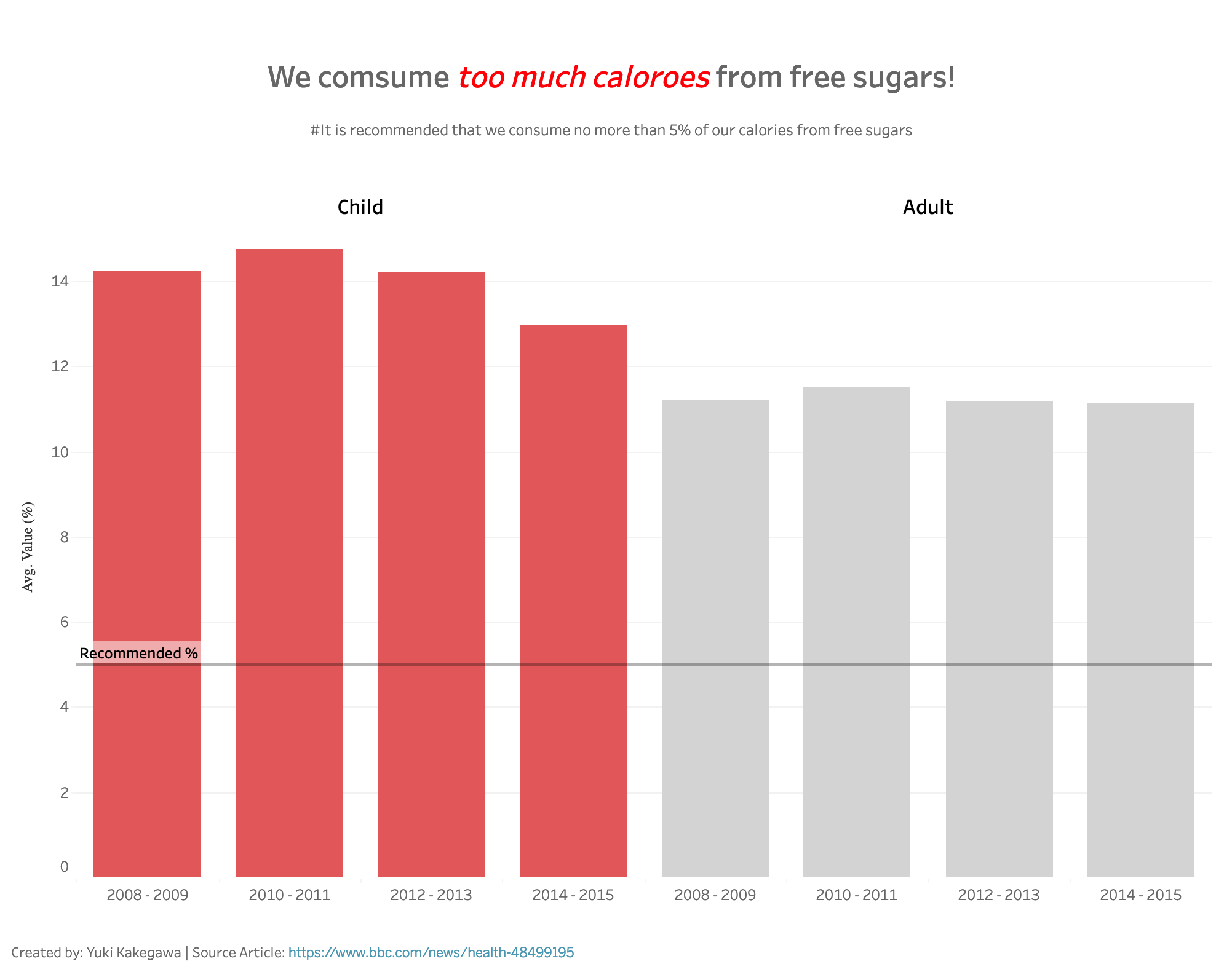
It looks like both children and adults take too much calories from free sugars…
Data Source | Interactive visualization