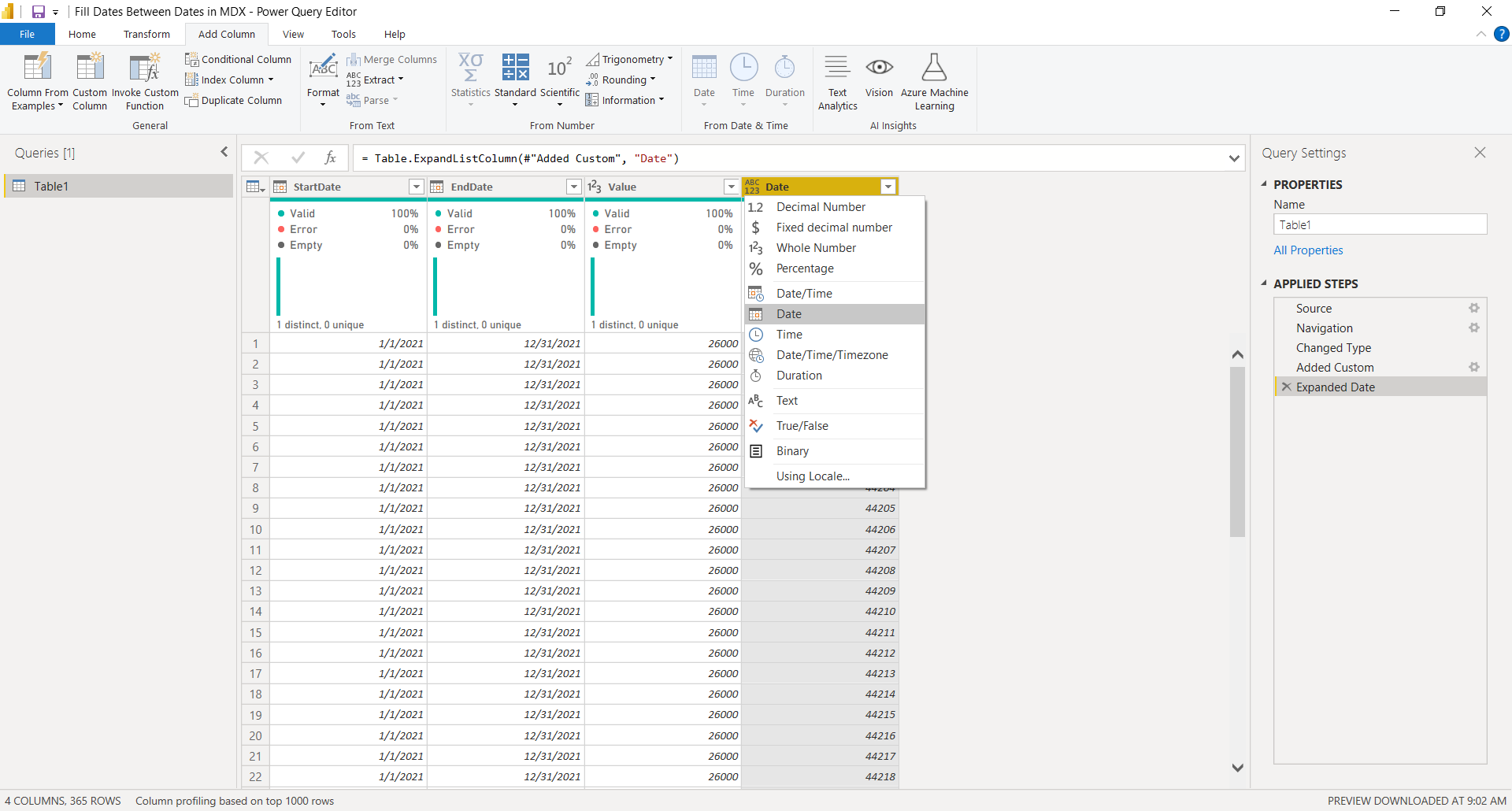
A step by step guide to fill dates between start date and end date
Month: May 2021
Greenhouse Gas Emission Across Supply Chain
MoM 2020 Week16 – Tableau Beef has the worst gas emissions across supply chain! I’ve heard that eating plant based foods is the best thing humans can do to reduce gas emissions, but this data confirms that information. This is why we need to look at data to see what is actually happening! We also…
Messi vs Ronald – Which Player is Better?
MoM 2020 Week15 – Tableau Messi and Ronald, they are both great soccer players, but which one is actually better? The answer to that questions is shown in this visualization. Tableau allows us to show each data point as a circle so that we can compare them side by side. I don’t recall the name…
Women Spent More Hours on Unpaid Work
MoM 2020 Week14 – Tableau I chose a simple bar chart to show difference in the unpaid hours of work spent between women and men. Women spend more than twice the amount of time on unpaid work than men, which is surprising! I initially thought that men would work longer, but this data / analysis…
Most Popular Pizza Topping in UK
MoM 2020 Week13 – Tableau This is my first time learning about and creating a lollipop chart. It give a bar chart a little more clarity in your message, depending on how you use it. I love how the color is used sparingly, but effectively, distinguishing between women and men. Gray color plays a vital…
How Many Courses are Taught at Berkeley?
MoM 2020 Week12 – Tableau I didn’t know if you have multiple line charts then you call them as small multiples… There is an option you can toggle in Power BI, but in Tableau, you just create each line chart separately and put them all together in one dashboard. As you can see in this…
Are Money and Happiness Correlated?
MoM 2020 Week11 – Tableau There is a clear trend telling us that the more money you have, the happier you may be. I created a bubble chart where the color of each value is dynamically set based on life satisfaction as well as GDP per capita. This was a little challenging but once you…
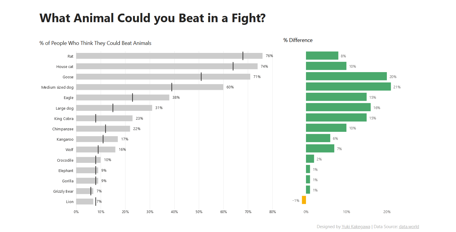
What Animal Could You Beat in a Fight?
MoM 2021 Week20 – Power BI

How Do You Create DAX Tables?
WoW 2021 Week20 – Power BI
Bar Chart with Simple Use of Color
MoM 2020 Week10 – Tableau It’s very interesting that the analysis tells you that if women don’t have education then violence against them are not likely to be justified (certain countries, see the data viz below). Data Source | Interactive visualization