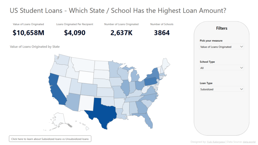
MoM 2021 Week24 – Power BI
Category: Makeover Monday
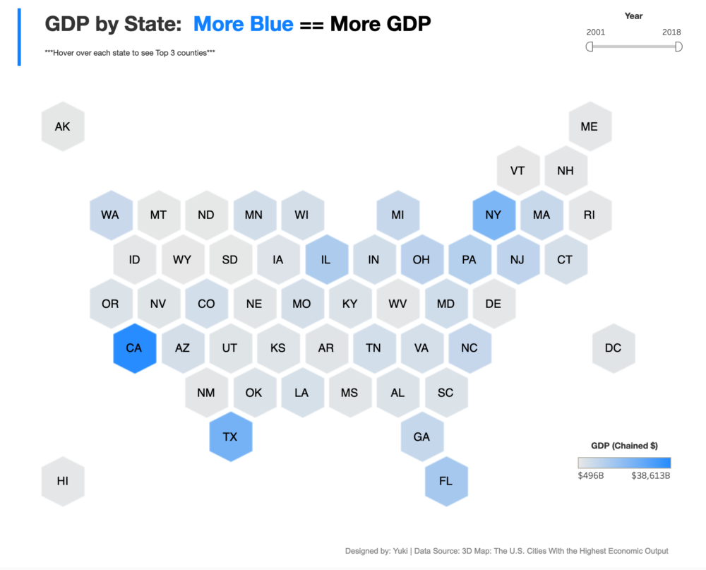
Hexagon Tile Map in Tableau
MoM 2020 Week40 – Tableau
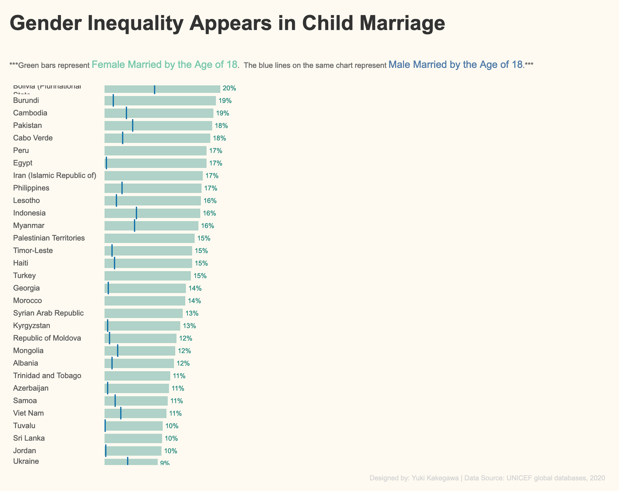
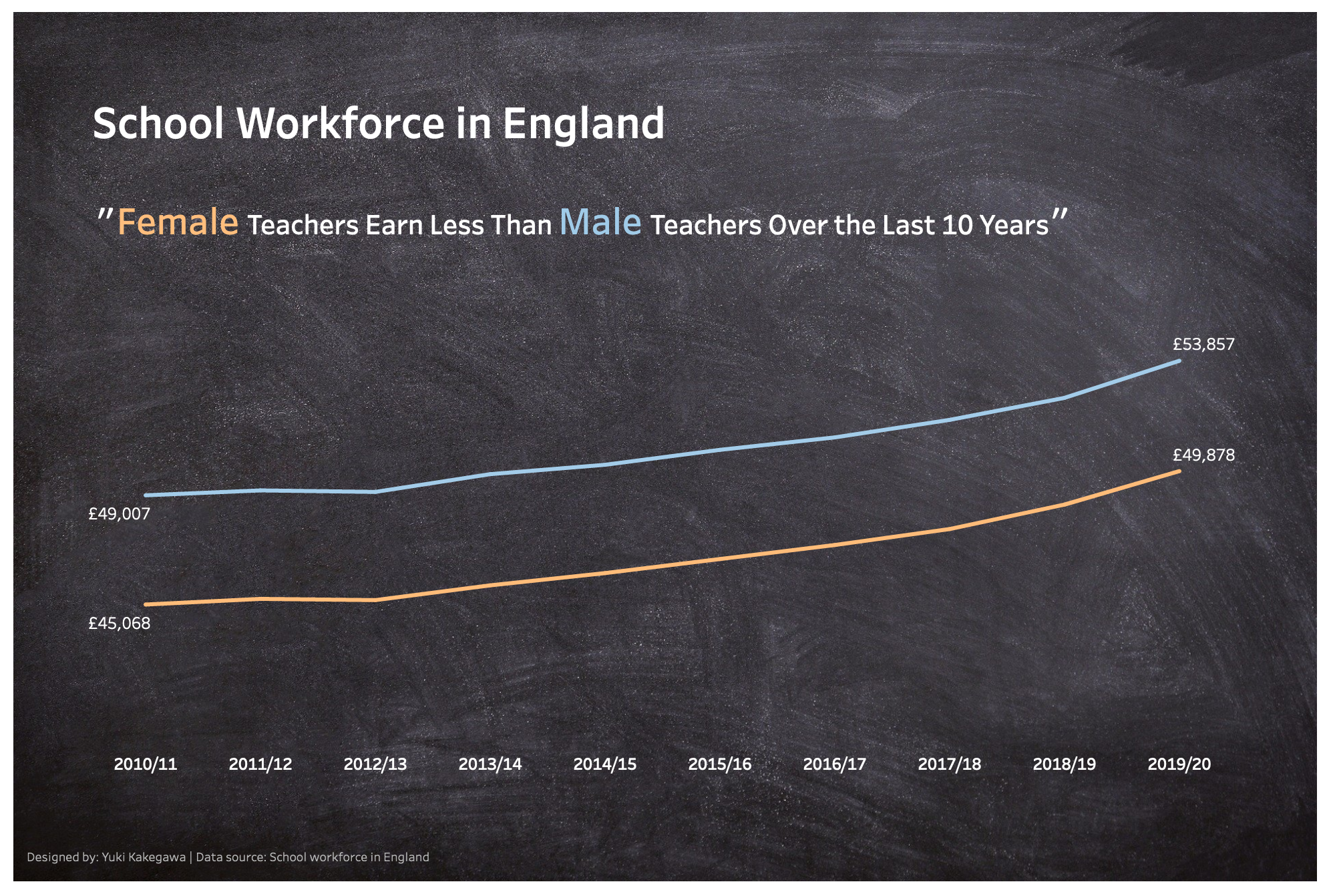
Gender Inequality in Child Marriage
MoM 2020 Week39 – Tableau
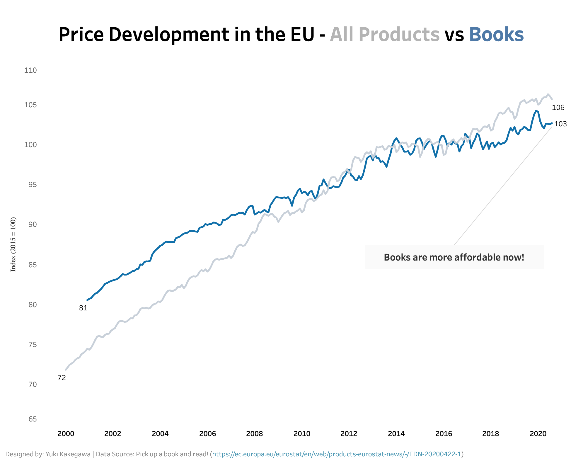
Books Are More Affordable Than Other Products in the EU
MoM 2020 Week38 – Tableau
Multiple Lines to Show Difference
MoM 2020 Week37 – Tableau
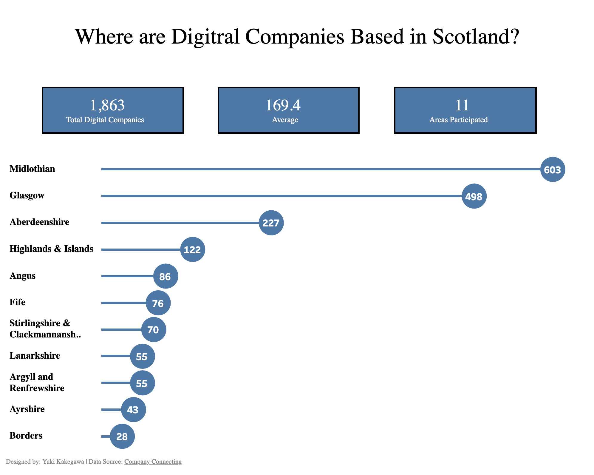
Digital Companies in Scotland
MoM 2020 Week33 – Tableau
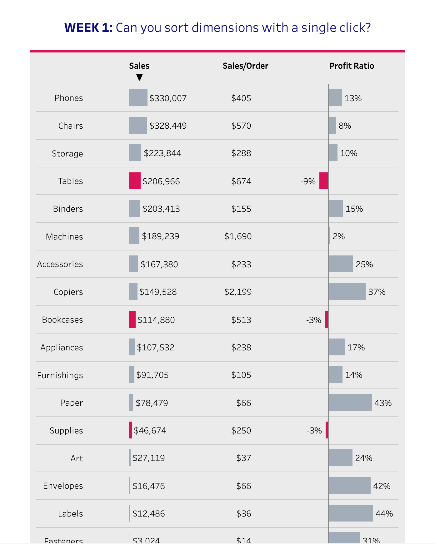
Sort Dimensions in a Single Click in Tableau
WoW 2020 Week1 – Tableau
Amazon is Investing in the Future…
MoM 2020 Week25 – Tableau A simple line chart showing a distinct pattern of Amazon’s revenues over time. Their profit started to increase around 2016! Interactive visualization
Greenhouse Gas Emission Across Supply Chain
MoM 2020 Week16 – Tableau Beef has the worst gas emissions across supply chain! I’ve heard that eating plant based foods is the best thing humans can do to reduce gas emissions, but this data confirms that information. This is why we need to look at data to see what is actually happening! We also…
Messi vs Ronald – Which Player is Better?
MoM 2020 Week15 – Tableau Messi and Ronald, they are both great soccer players, but which one is actually better? The answer to that questions is shown in this visualization. Tableau allows us to show each data point as a circle so that we can compare them side by side. I don’t recall the name…