Menu
Stuff by Yuki
  • Home
  • Data Engineering
    • Python
  • Business Intelligence
    • Power BI
    • Tableau
  • Perspectives
  • About
  • Contact
Stuff by Yuki

Tableau Dashboard – Superstore

Posted on May 18, 2021

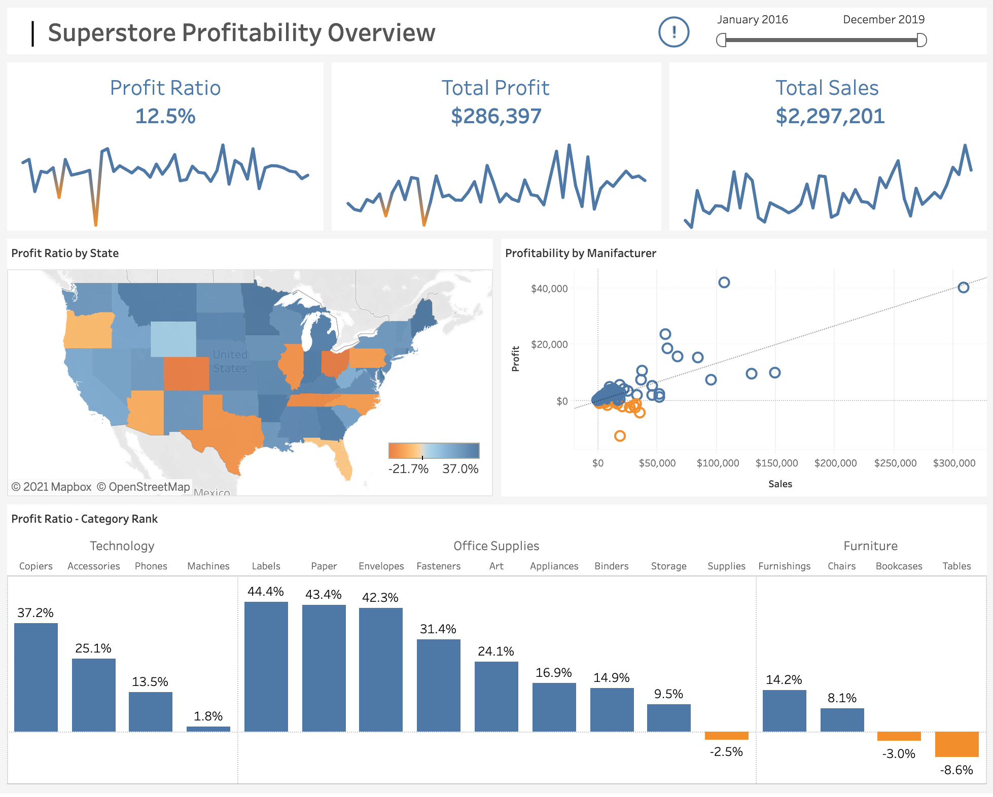
A tableau dashboard showing an overview of the profitability at Superstore (sample dataset).

Only 2 colors are used, blue and orange. As you can see, orange represents negative values, whereas blue color shows the positive values. Conditional color is implemented in tooltip texts as well.

You can see and understand the trends in just a second because there are three trend lines under each main metric.

By using this simple dashboard, end users will be able to get a lot of information on profitability broken down by states, manufacturers, products as well as the high level view of the store profit.

Interactive visualization

Leave a Reply Cancel reply

Your email address will not be published. Required fields are marked *

Recent Posts

  • Where I’m Headed in the Next 5 Years
  • Open-Source vs Vendor Data Tools
  • Developing the Habit of Writing
  • How to Inspect and Optimize Query Plans in Python Polars
  • Learn Python Polars with Polars Cookbook

Popular Posts

  • A Running Total Calculation with Quick Measure in Power BI
  • A Complete Guide to Git Integration in Power BI
  • How To Copy And Paste Report Page in Power BI
  • Handling Missing Values in Polars
  • How to Convert String to Date or Datetime in Polars

connect with me

  • LinkedIn
  • Twitter
  • Github
  • Website

Search Articles

©2025 Stuff by Yuki | Powered by SuperbThemes