Introduction to NetworkX and Pyvis in Python
I recently worked on creating a network visualization for the first time! I had no idea what package would allow me to create such visualizations, so I went ahead and googled about it. Then I got to this medium article explaining 3 network visualization packages in Python. After researching a little bit, I decided to give it NetworkX and Pyvis a try!
What data to visualize
There are probably a lot of network data available online, but for the simplicity sake, I quickly created my own dataset that only contains my family members with weights on each edge. If you don’t know what an edge is or network analysis and graph theory in general, the Wikipedia site explains them pretty well.
My data contains columns like “source”, “target”, and “weight”.
Network visualization with NetworkX
For this to work and visualize the data, I used other libraries like Pandas (my favorite!) and Matplotlib.
import pandas as pd
import numpy as np
import networkx as nx
import matplotlib.pyplot as plt
df = pd.read_csv('data.csv')
G=nx.from_pandas_edgelist(df, 'source', 'target')
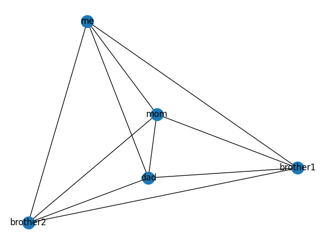
nx.draw(G, with_labels=True)
plt.show()It’s awesome that NetworkX allows us to get data from a pandas dataframe! And here is the visualization output of the code:
Network visualization with Pyvis
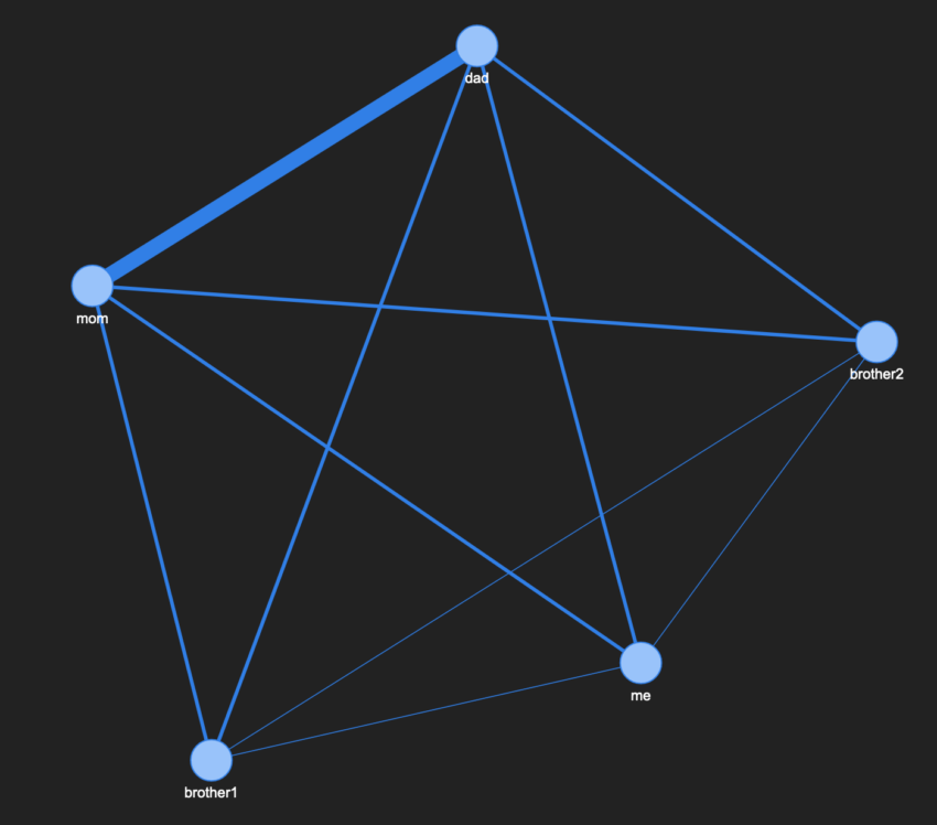
What’s different between NetworkX and Pyvis is that visualizations created in NetworkX are static, but Pyvis can create dynamic visualizations because it’s essentially producing html code as you run your Python script. And here’s the screenshot of the visualization!

In this one, I made it so that it shows the weights on each edge. You can see how my parents are connected with a thicker edge, but my siblings and I are connected with thinner edges…(this is just some mock data though!)
If you hover each node, you’ll see the list of neighbors of the node you’re hovering over. That’s defined towards the end of the code pasted below.
from pyvis.network import Network
import pandas as pd
import matplotlib.pyplot as plt
net = Network(height='750px', width='100%', bgcolor='#222222', font_color='white')
# set the physics layout of the network
net.barnes_hut()
got_data = pd.read_csv('data.csv')
sources = got_data['source']
targets = got_data['target']
weights = got_data['weight']
edge_data = zip(sources, targets, weights)
for e in edge_data:
src = e[0]
dst = e[1]
w = e[2]
net.add_node(src, src, title=src)
net.add_node(dst, dst, title=dst)
net.add_edge(src, dst, value=w)
neighbor_map = net.get_adj_list()
# add neighbor data to node hover data
for node in net.nodes:
node['title'] += ' Neighbors:<br>' + '<br>'.join(neighbor_map[node['id']])
node['value'] = len(neighbor_map[node['id']])
plt.show()
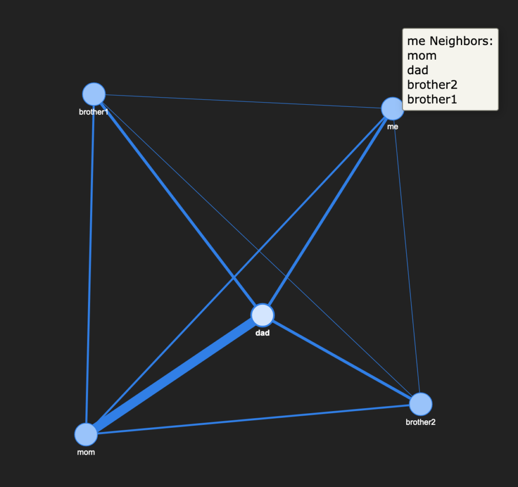
net.show('myfamily.html')And Pyvis even allows us to move each node around! This is something NetworkX package lacks (as far as I know. I could be wrong). Here’s the screenshot of the hover over on “me” after moved around nodes a bit:
Conclusion
I very much enjoyed exploring and playing around these network visualization packages in Python. Although I pretty much picked up example code from their documentation pages and adjusted some parts for my needs, it took me a few hours putting everything together. But it definitely was worth the time! I look forward to building more interesting projects on network analysis/visualization and graph theory 🙂