Highlighting the last value in Bar Chart
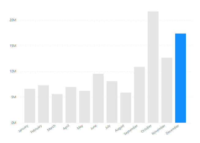
I’ve seen so many visuals created in Tableau or some other tool where a bar chart with the last bar or particular bar is colored / highlighted differently than others. But for some reason, I don’t think I’ve seen this much in Power BI (screenshot below is in Power BI).
I personally like that approach, but thought that maybe other people don’t know how to do, so I decided to explain how to do it!
How to Dynamically Highlight the Last Bar
The first approach that many developers think of is to assign color for each bar in a bar chart. But that’s very tedious and not fun! My approach is to create a DAX code and assign that measure in to the color for the bar chart, so that it’s dynamic. So there won’t be any need to assign the color one by one!
I’m using the sample financial dataset, and if you wanna follow along, you can download the Power BI file here: Github
Here’s the DAX code I created:
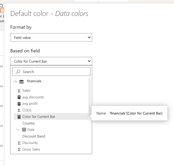
Color for Current Bar =
var _lastDate = CALCULATE( LASTDATE( financials[Date] ), ALL( financials ) )
var _lastDateInContext = LASTDATE( financials[Date] )
var _res = IF( _lastDate = _lastDateInContext , "#118DFF", "#E5E5E5")
RETURN
_res
This code should be easy to understand if you understand the filter context, but if you don’t, it may not as easy as it looks. What’s written is that you just get both the last dates; one that’s shown in the visual within the date values (year, month, etc) as well as the overall last date of your entire table (date table). And you check if the last date in the context matches that of the entire date table.
After you have created your DAX measure, you’ll need to assign that measure to the color pane for the visual:
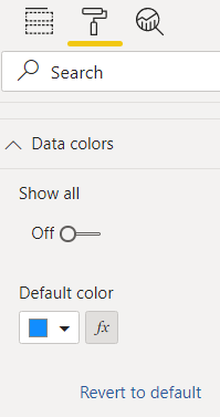
Click the button next to the color that says “fx”. Then you format it by “Field value” and pick the DAX measure you’ve created.
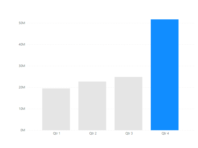
Make sure that the last bar is highlighted or has a different color than others in any date axis.
And that’s it! Let me know if you have any questions.
Resource: Github