Visualizing Coordicates in Vega-Lite
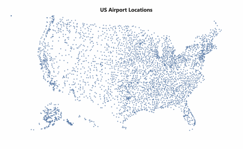
There is a great example in this Vega-Lite documentation page. In this web page, if you scroll down enough, you’ll see an example for a map visualization using latitude and longitude:
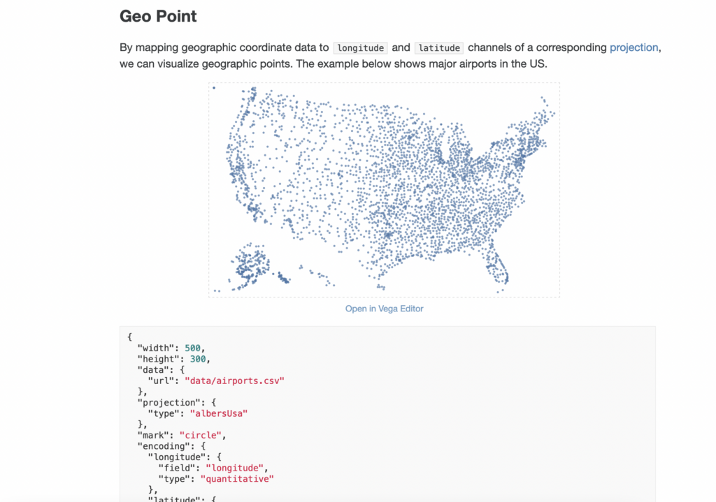
Click on “Open in Vega Editor”. It’ll open an editor with the code already built for you:
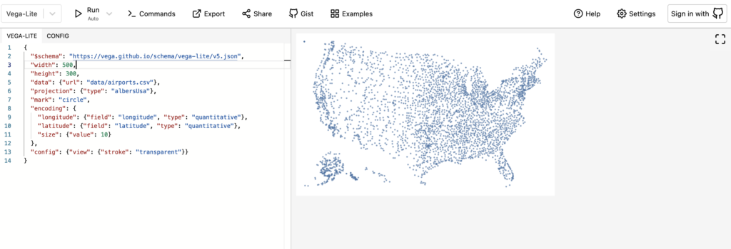
And this vega editor is where you can test your code with ease. You don’t even have to open your text editor to edit and test your code.
What the code is basically doing is that it adds circles per latitude and longitude. Here’s the code for you to copy:
{
  "$schema": "https://vega.github.io/schema/vega-lite/v5.json",
  "width": 500,
  "height": 300,
  "data": {"url": "data/airports.csv"},
  "projection": {"type": "albersUsa"},
  "mark": "circle",
  "encoding": {
    "longitude": {"field": "longitude", "type": "quantitative"},
    "latitude": {"field": "latitude", "type": "quantitative"},
    "size": {"value": 10}
  },
  "config": {"view": {"stroke": "transparent"}}
}
Visualizing Coordicates in Power BI with Deneb
Deneb is a custom visualization in Power BI and it’s built off of vega-lite. Think of it as vega-lite for Power BI.
The code itself is pretty much the same except that:
- I referenced the data a little differently
- I added the tooltip
- I didn’t specify the height and width
Here’s the exact code I used to create above Power BI Deneb visualization. Notice those few things I mentioned above:
{
    "$schema": "https://vega.github.io/schema/vega-lite/v5.json",
    "usermeta": {
      "deneb": {
        "build": "1.4.0.0",
        "metaVersion": 1,
        "provider": "vegaLite",
        "providerVersion": "5.4.0"
      },
      "interactivity": {
        "tooltip": true,
        "contextMenu": true,
        "selection": true,
        "highlight": true,
        "dataPointLimit": 50
      },
      "information": {
        "name": "Geo Point Map",
        "description": "[No Description Provided]",
        "author": "[No Author Details Provided]",
        "uuid": "e69195fe-4d23-4b0d-8133-f72e26467f3f",
        "generated": "2022-11-09T05:23:55.201Z"
      },
      "dataset": [
        {
          "key": "__0__",
          "name": "Airport Name",
          "description": "",
          "type": "text",
          "kind": "column"
        },
        {
          "key": "__1__",
          "name": "City",
          "description": "",
          "type": "text",
          "kind": "column"
        },
        {
          "key": "__2__",
          "name": "State",
          "description": "",
          "type": "numeric",
          "kind": "column"
        },
        {
          "key": "__3__",
          "name": "Longitude",
          "description": "",
          "type": "numeric",
          "kind": "column"
        },
        {
          "key": "__4__",
          "name": "Latitude",
          "description": "",
          "type": "numeric",
          "kind": "column"
        }
      ]
    },
    "config": {
      "view": {"stroke": "transparent"},
      "font": "Segoe UI",
      "arc": {},
      "area": {
        "line": true,
        "opacity": 0.6
      },
      "bar": {},
      "line": {
        "strokeWidth": 3,
        "strokeCap": "round",
        "strokeJoin": "round"
      },
      "path": {},
      "point": {
        "filled": true,
        "size": 75
      },
      "rect": {},
      "shape": {},
      "symbol": {
        "strokeWidth": 1.5,
        "size": 50
      },
      "text": {
        "font": "Segoe UI",
        "fontSize": 12,
        "fill": "#605E5C"
      },
      "axis": {
        "ticks": false,
        "grid": false,
        "domain": false,
        "labelColor": "#605E5C",
        "labelFontSize": 12,
        "titleFont": "wf_standard-font, helvetica, arial, sans-serif",
        "titleColor": "#252423",
        "titleFontSize": 16,
        "titleFontWeight": "normal"
      },
      "axisQuantitative": {
        "tickCount": 3,
        "grid": true,
        "gridColor": "#C8C6C4",
        "gridDash": [1, 5],
        "labelFlush": false
      },
      "axisX": {"labelPadding": 5},
      "axisY": {"labelPadding": 10},
      "header": {
        "titleFont": "wf_standard-font, helvetica, arial, sans-serif",
        "titleFontSize": 16,
        "titleColor": "#252423",
        "labelFont": "Segoe UI",
        "labelFontSize": 13.333333333333332,
        "labelColor": "#605E5C"
      },
      "legend": {
        "titleFont": "Segoe UI",
        "titleFontWeight": "bold",
        "titleColor": "#605E5C",
        "labelFont": "Segoe UI",
        "labelFontSize": 13.333333333333332,
        "labelColor": "#605E5C",
        "symbolType": "circle",
        "symbolSize": 75
      }
    },
    "data": {"name": "dataset"},
    "projection": {"type": "albersUsa"},
    "mark": "circle",
    "encoding": {
      "longitude": {
        "field": "__3__",
        "type": "quantitative"
      },
      "latitude": {
        "field": "__4__",
        "type": "quantitative"
      },
      "size": {"value": 30},
      "tooltip": [
        {
          "field": "__0__",
          "type": "nominal"
        },
        {
          "field": "__1__",
          "type": "nominal"
        },
        {
          "field": "__2__",
          "type": "nominal"
        },
        {
          "field": "__3__",
          "type": "quantitative"
        },
        {
          "field": "__4__",
          "type": "quantitative"
        }
      ]
    }
  }
And here’s the Deneb template which you can just import into your deneb visual to reproduce the same visual:
{
    "data": {
        "name": "dataset"
    },
    "projection": {
        "type": "albersUsa"
    },
    "mark": "circle",
    "encoding": {
        "longitude": {
            "field": "Longitude",
            "type": "quantitative"
        },
        "latitude": {
            "field": "Latitude",
            "type": "quantitative"
        },
        "size": {
            "value": 30
        },
        "tooltip": [
            {
                "field": "Airport Name",
                "type": "nominal"
            },
            {
                "field": "City",
                "type": "nominal"
            },
            {
                "field": "State",
                "type": "nominal"
            },
            {
                "field": "Longitude",
                "type": "quantitative"
            },
            {
                "field": "Latitude",
                "type": "quantitative"
            }
        ]
    }
}
Hope this post helps you get started on map visualizations in Vega-Lite and/or Deneb in Power BI!
You can find the resources in this github repo.