Waffle Chart in Power BI
An easy way to go about creating a waffle chart in Power BI is to use a custom visual. And that’s what I’ll be using to demonstrate in this blog. It looks like there is a way to do that without using a custom visual introduced in this data-goblin’s website .
Jsut FYI, I learned to use this custom visual because of one of the projects for Workout-Wednesday Power BI. It’s one of the best resources honing your Power BI skills that I recommend to anybody 🙂
Creating a Waffle Chart with a Custom Visual
I used this custom visual for the visualization. Please note that there is probably more custom visuals that can do that same.
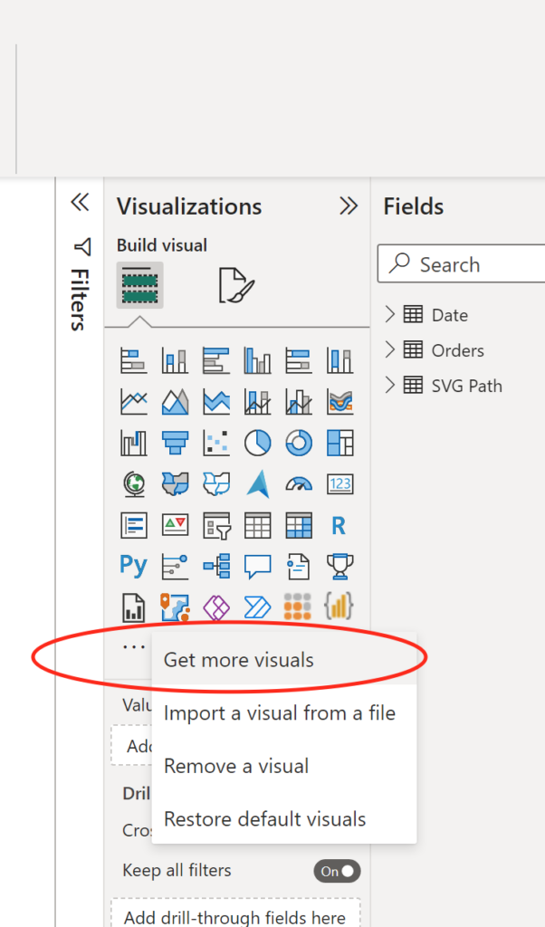
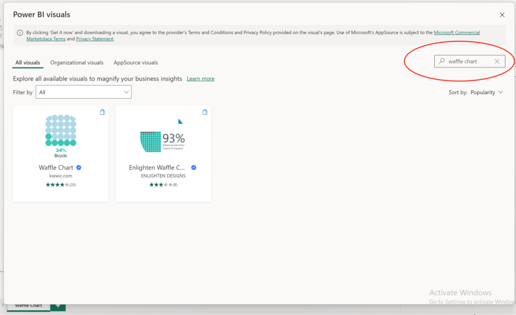
- Firstly, you need to download the custom visual from the marketplace in power bi deskop. Click on the three dots and once a window pops up, type in “waffle chart”. And pick the one on the left, created by kiewic.com.
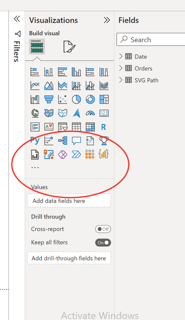
- Confirm that the visual has been added to your visualization collection. Note that I already pinned the visual, so yours will appear right below the three dots.
- Then you click on the visual icon or drag and drop it onto the canvas just like you do when you create other visuals. And add fields that you want to see in the waffle chart.
Here’s the definition of my DAX measure:
% Sales Grand Total =
VAR _Sales = [Total Sales]
VAR _AllInTheCurrentVisual =
CALCULATE (
    [Total Sales],
    ALLSELECTED ( Orders[Segment] )
)
VAR GrandTotalPercent =
ROUND ( DIVIDE( _Sales, _AllInTheCurrentVisual ) * 100, 0 )

RETURN

GrandTotalPercent
That’s pretty much it! You can customize the figure used in the visual using this website. That’s done by changing “Paths” parameter in the visual.
But other than that, no further modifications are needed!
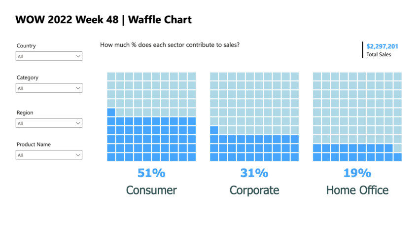
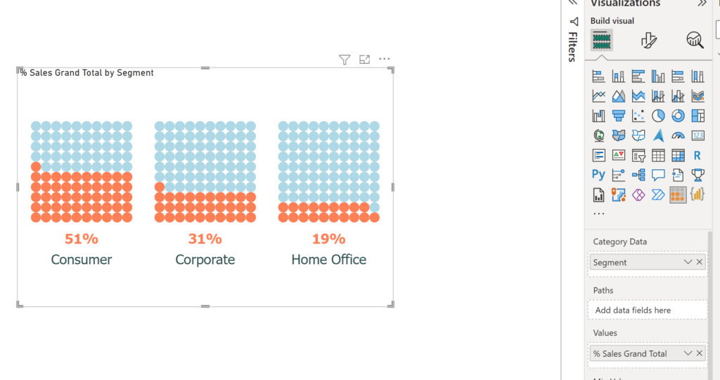
Here’s the final version of my visualization:
Power BI file you can download: my github repo
Conclusion
Hope you were able to follow my step by step instructions! This workout-wednesday project also teaches you to create the same visual.
Great post.