Hex Maps in Power BI
You’ll need to use a custom visual to create a hex map as there is no default visual for that in Power BI. In this post, we’ll use one called “Synoptic Panel” created by okviz. The creator of okviz is the same as sqlbi, which probably is the best resource for learning Power BI in general!
Creating a Hex Map with Synoptic Panel Custom Visual
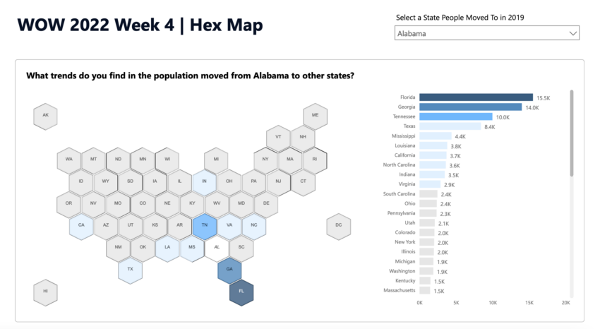
The Power BI report I created is for Workout-Wednesday 2022 Week4. The dataset is this one found on data.world. There is some data transformations required, so if you’d like to do this from scratch, please refer the link I mentioned explaining the solution. Otherwise, you can download my Power BI report here with the data already transformed. You can create a new report page to follow along.
Download Synoptic Panel Visual
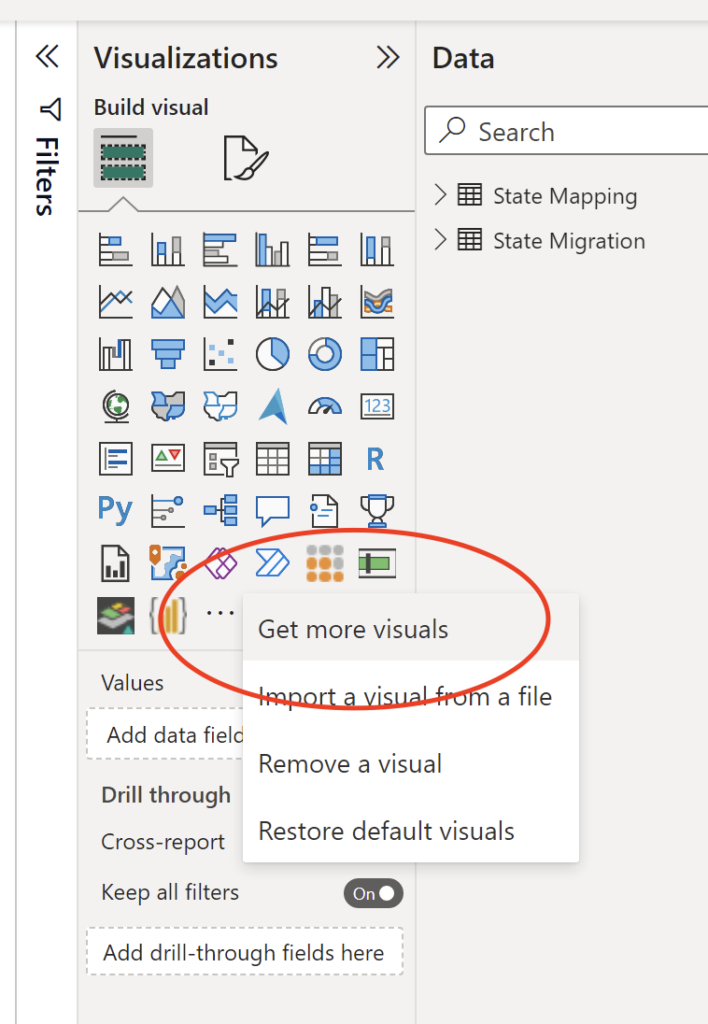
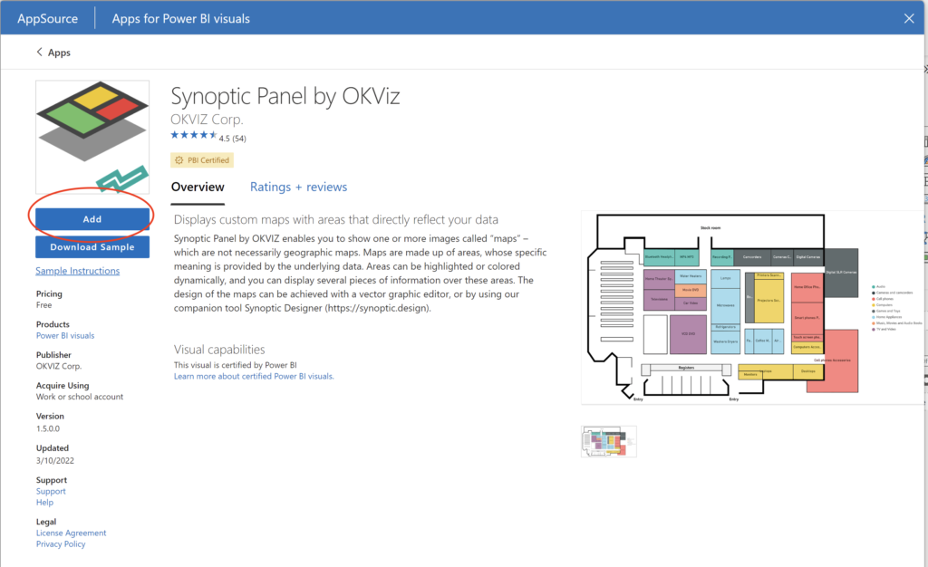
Click on “get more visuals” in the visual pane:
Type “synoptic” in the search bar. And Synoptic Panel by Okviz should pop up!
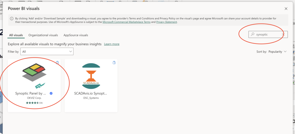
Make sure you click on “add”. After that you should see a new visual added in your visualization pane.
Adding Fields and Measures to the Visual
After you downloaded the visual, the only things you need to do are to:
- Add category, measure, and states measure
- Format colors, fonts, etc
For measures, I created “Total Population Moving” and “Rank”.
Total Population Moving = SUM( 'State Migration'[Population Moving] )
Rank =
RANKX(
    ALLEXCEPT('State Migration', 'State Migration'[State To]),
    [Total Population Moving],
    ,
    DESC
)
The second measure might look a little complicated if you’re not used to useing RANK() or ALLEXCEPT().
It’s basically trying to rank the data based on “Total Population Moving” where you’re considering only the filters applied to “State To” column. And that makes it possible to have users select a value in the “State To” column and still shows the correct ranking.
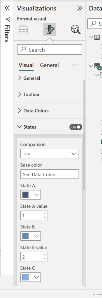
This Rank measure is used to conditionally format the colors of each tile in the visualization.
The conditional formatting looks like this:
And that’s it. Now you should have a hex map visual like in the following report: