MoM 2020 Week33 – Tableau
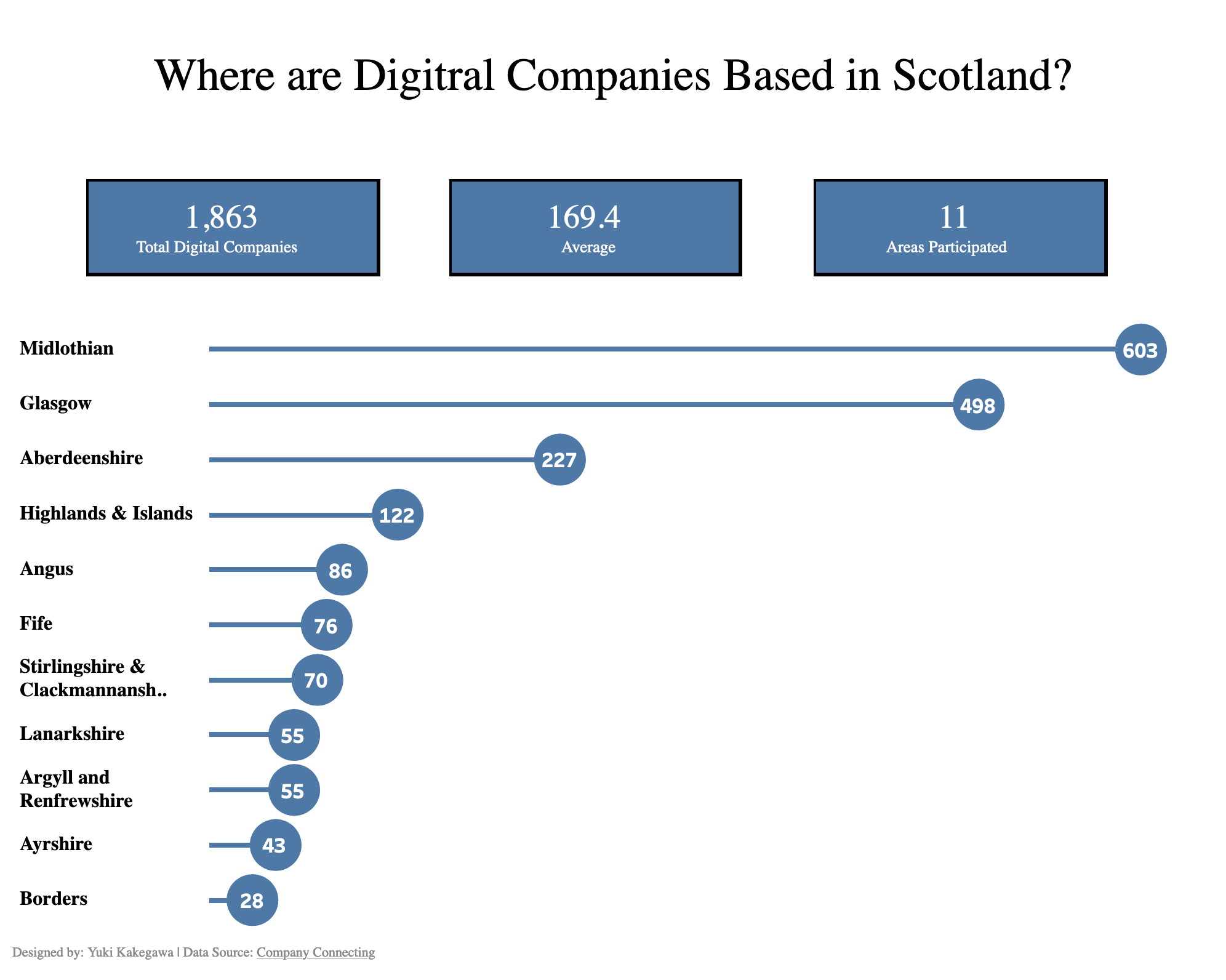
Using a lollipop chart is effective for showing the comparison of the number of digital companies based in Scotland. A bar chart is always good for this, but a lollipop chart also give some design variation and conciseness to the whole visual.
