Menu
Stuff by Yuki
  • Home
  • Data Engineering
    • Python
  • Business Intelligence
    • Power BI
    • Tableau
  • Perspectives
  • About
  • Contact
Stuff by Yuki

Are Money and Happiness Correlated?

Posted on May 22, 2021

MoM 2020 Week11 – Tableau

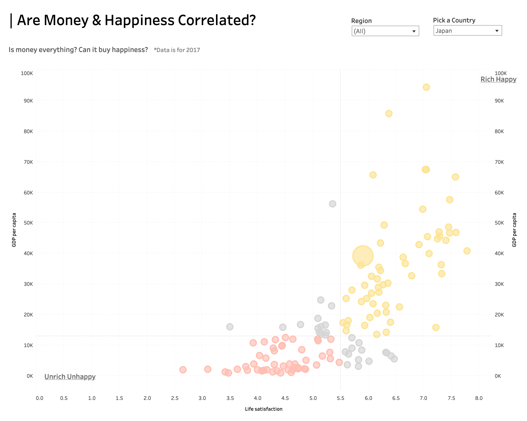
There is a clear trend telling us that the more money you have, the happier you may be. I created a bubble chart where the color of each value is dynamically set based on life satisfaction as well as GDP per capita. This was a little challenging but once you figured out, it’ll definitely be times that I need to create this type of visual, so it was worth the time learning it!

Data Source | Interactive visualization

Leave a Reply Cancel reply

Your email address will not be published. Required fields are marked *

Recent Posts

  • Where I’m Headed in the Next 5 Years
  • Open-Source vs Vendor Data Tools
  • Developing the Habit of Writing
  • How to Inspect and Optimize Query Plans in Python Polars
  • Learn Python Polars with Polars Cookbook

Popular Posts

  • A Running Total Calculation with Quick Measure in Power BI
  • A Complete Guide to Git Integration in Power BI
  • How To Copy And Paste Report Page in Power BI
  • Handling Missing Values in Polars
  • How to Convert String to Date or Datetime in Polars

connect with me

  • LinkedIn
  • Twitter
  • Github
  • Website

Search Articles

©2025 Stuff by Yuki | Powered by SuperbThemes