Menu
Stuff by Yuki
  • Home
  • Data Engineering
    • Python
  • Business Intelligence
    • Power BI
    • Tableau
  • Perspectives
  • About
  • Contact
Stuff by Yuki

Which Country is the Richest?

Posted on May 13, 2021

MoM 2020 Week7 – Tableau

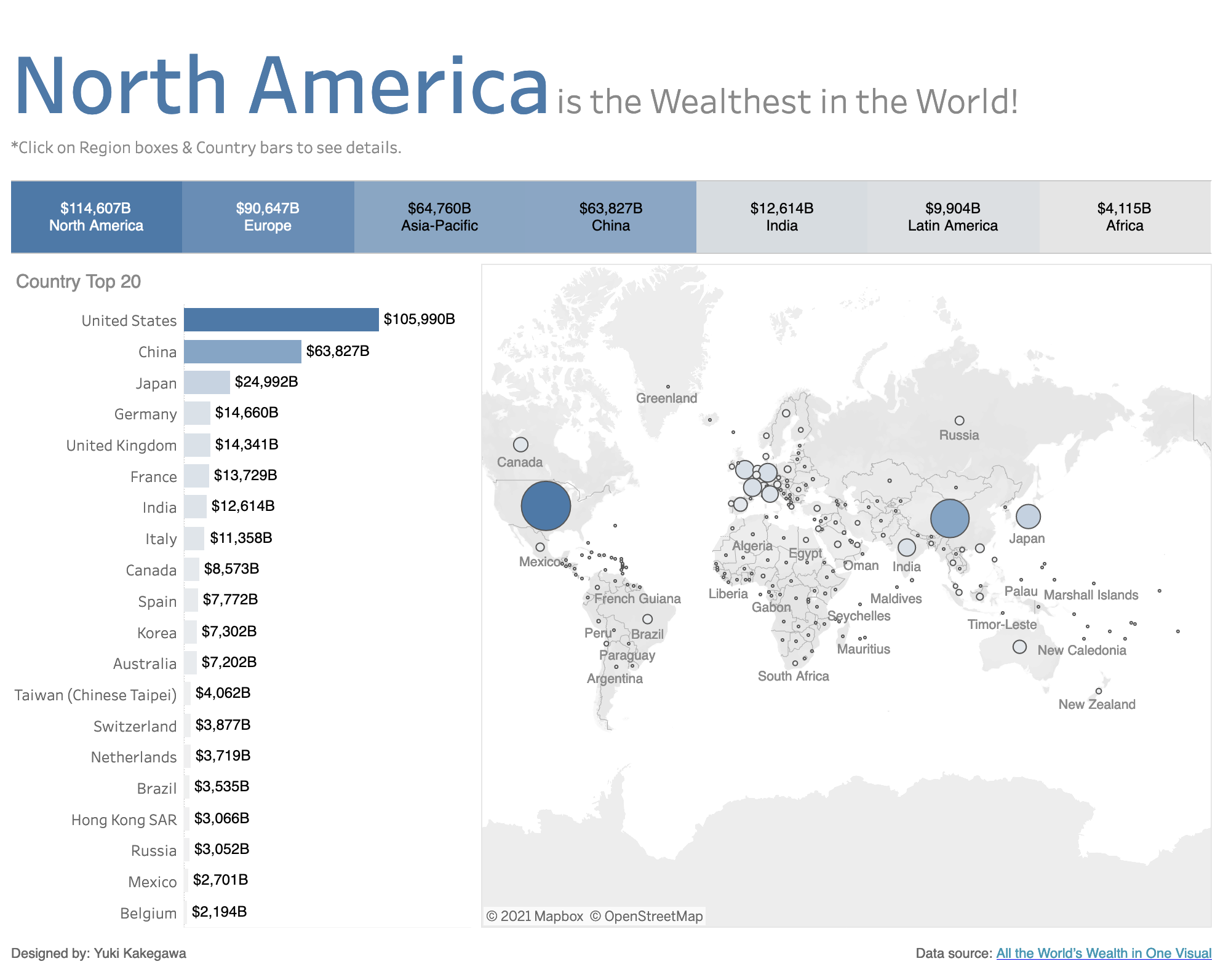
I created more of a dashboard than a visualization for MoM2020 Week7.

I always emphasize the part or data that should get the attention the most by making it colored or bigger in size.

I follow the practice of the lesser number of colors you use, the cleaner the visualizations will look. That means you can tell your story better by considering how you use colors!

Data Source | Interactive visualization

Leave a Reply Cancel reply

Your email address will not be published. Required fields are marked *

Recent Posts

  • Where I’m Headed in the Next 5 Years
  • Open-Source vs Vendor Data Tools
  • Developing the Habit of Writing
  • How to Inspect and Optimize Query Plans in Python Polars
  • Learn Python Polars with Polars Cookbook

Popular Posts

  • A Running Total Calculation with Quick Measure in Power BI
  • A Complete Guide to Git Integration in Power BI
  • How To Copy And Paste Report Page in Power BI
  • Handling Missing Values in Polars
  • How to Convert String to Date or Datetime in Polars

connect with me

  • LinkedIn
  • Twitter
  • Github
  • Website

Search Articles

©2025 Stuff by Yuki | Powered by SuperbThemes